

List Plugin
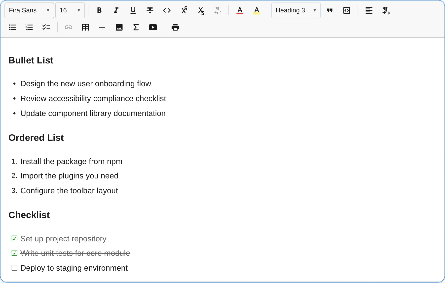
The ListPlugin provides bullet lists, ordered (numbered) lists, and checklists with indent/outdent support up to configurable nesting depth.
import { ListPlugin } from '@notectl/core/plugins/list';
new ListPlugin()// or with custom config:new ListPlugin({ types: ['bullet', 'ordered'], maxIndent: 3 })
Configuration
Section titled “Configuration”interface ListConfig { /** Which list types to enable. Default: ['bullet', 'ordered', 'checklist'] */ readonly types: ListType[]; /** Maximum nesting level. Default: 4 */ readonly maxIndent: number; /** Live Markdown shortcuts `- `/`* ` (bullet), `1. ` (ordered), `[ ] ` (checklist). Default: true */ readonly inputRule?: boolean; /** Allow checkbox toggling in read-only mode. Default: false */ readonly interactiveCheckboxes?: boolean; /** Override the plugin locale independently from the global editor locale. */ readonly locale?: ListLocale;}
type ListType = 'bullet' | 'ordered' | 'checklist';Example: Only bullet and ordered lists
Section titled “Example: Only bullet and ordered lists”new ListPlugin({ types: ['bullet', 'ordered'] })Example: Deep nesting
Section titled “Example: Deep nesting”new ListPlugin({ maxIndent: 8 })Example: Interactive checkboxes in read-only mode
Section titled “Example: Interactive checkboxes in read-only mode”When interactiveCheckboxes is enabled, checklist checkboxes remain clickable even when the editor is in read-only mode. All other editing is still blocked.
const editor = await createEditor({ readonly: true, plugins: [new ListPlugin({ interactiveCheckboxes: true })],});See the Read-Only Checklist guide for a full walkthrough.
Locale Override
Section titled “Locale Override”Each plugin resolves its locale automatically from the editor’s global locale setting. To override independently:
import { ListPlugin, loadListLocale } from '@notectl/core/plugins/list';
const listDe = await loadListLocale('de');new ListPlugin({ locale: listDe })
See the Internationalization guide for details.
Commands
Section titled “Commands”| Command | Description | Returns |
|---|---|---|
toggleList:bullet |
Toggle bullet list on current block(s) | boolean |
toggleList:ordered |
Toggle ordered list on current block(s) | boolean |
toggleList:checklist |
Toggle checklist on current block(s) | boolean |
indentListItem |
Increase indent level (up to maxIndent) |
boolean |
outdentListItem |
Decrease indent level | boolean |
toggleChecklistItem |
Toggle checked state on checklist item (no-op in read-only mode unless interactiveCheckboxes is enabled) |
boolean |
All toggle and indent/outdent commands support multi-block selections. When multiple blocks are selected, the command applies to every block in the range.
// Create a bullet listeditor.executeCommand('toggleList:bullet');
// Indent a list itemeditor.executeCommand('indentListItem');
// Toggle a checkboxeditor.executeCommand('toggleChecklistItem');
Keyboard Shortcuts
Section titled “Keyboard Shortcuts”| Shortcut | Action |
|---|---|
Enter |
Split list item; exit list if the item is empty. Inside a multi-block item, splits the current child paragraph; on an empty trailing child it exits into a new sibling item |
Backspace |
Convert to paragraph when cursor is collapsed at start of item. At the start of a multi-block item’s first child it un-lists the whole item into its blocks |
Tab |
Indent list item (increase nesting), also from inside a child block |
Shift+Tab |
Outdent list item (decrease nesting), also from inside a child block |
Mod+Enter |
Toggle the checked state of a checklist item, also from inside a child block (Mod is Ctrl on Windows/Linux, Cmd on macOS) |
Input Rules
Section titled “Input Rules”Type at the beginning of a line:
| Pattern | Result |
|---|---|
- or * |
Bullet list |
1. (any number followed by .) |
Ordered list |
[ ] |
Unchecked checklist item |
[x] |
Checked checklist item |
Toolbar
Section titled “Toolbar”Three toolbar buttons, one for each list type. Each button toggles its respective list type. The active state highlights when the cursor is inside a matching list item.
| Button | Icon | List Type |
|---|---|---|
| Bullet list | Bullet icon | bullet |
| Ordered list | Number icon | ordered |
| Checklist | Checkbox icon | checklist |
Node Spec
Section titled “Node Spec”| Type | Attributes | Description |
|---|---|---|
list_item |
listType, indent, checked |
Single list node type for all list variants |
// Attribute typesinterface ListItemAttributes { listType: 'bullet' | 'ordered' | 'checklist'; indent: number; // 0-based, max is maxIndent checked: boolean; // Only meaningful for checklist items}notectl uses a flat sibling model: each list_item carries its own listType and indent level, so nesting between items needs no deep tree and indent/outdent stays a simple attribute change.
Item content is hybrid: the common single-paragraph item is a leaf holding inline text, while an item with several blocks (a second paragraph, a code block, a blockquote, a heading) is a container whose children are regular blocks. Multi-block items arrive via Markdown import, HTML paste, or the JSON API, and round-trip losslessly through getContentMarkdown(), getContentHTML(), and getJSON().
// A multi-block list item in JSON form{ type: 'list_item', attrs: { listType: 'bullet', indent: 0, checked: false }, children: [ { type: 'paragraph', children: [{ text: 'first paragraph' }] }, { type: 'code_block', attrs: { language: 'ts' }, children: [{ text: 'const x = 1;' }] }, ],}Allowed child blocks: paragraph, heading, code_block, blockquote, horizontal_rule. A list_item cannot nest inside another list_item — sibling nesting always goes through the indent attribute.
Multi-Block Selections
Section titled “Multi-Block Selections”When you select text spanning multiple blocks:
- Toggle commands (
toggleList:bullet,toggleList:ordered,toggleList:checklist) convert all blocks in the selection to the chosen list type. If all selected blocks are already that list type, they are all reverted to paragraphs. - Indent/Outdent (
indentListItem,outdentListItem) adjusts the indent of every list item in the selection. Non-list blocks are skipped. - Toolbar active state reflects the selection: a list button shows as active only when every block in the range matches that list type.