

Blockquote Plugin
The BlockquotePlugin adds block quote support with a toggle command, keyboard shortcut, and Markdown-style input rule.
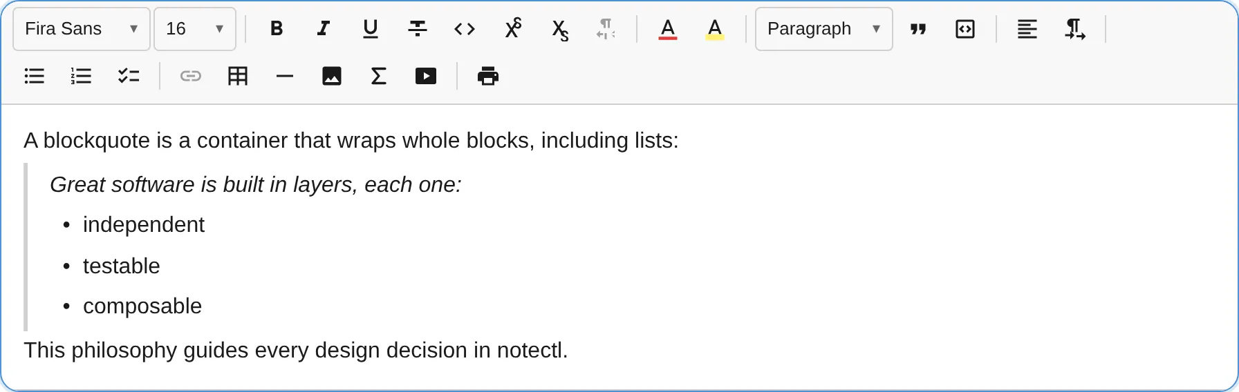
A blockquote is a container block: it wraps other blocks rather than holding text directly. A single quote can contain paragraphs, headings, lists, and even nested blockquotes, mirroring the HTML semantics of <blockquote> as flow content. This means you can quote a whole list or a multi-block passage without losing its structure.
Container model
Section titled “Container model”Toggling blockquote on a selection wraps every selected top-level block into one shared blockquote; toggling it off lifts those blocks back out. Wrapping preserves the wrapped blocks exactly, so list markers, heading levels, and inline marks survive the operation.
blockquote heading "Quarterly goals" paragraph "We agreed on three priorities:" list_item "Ship the editor" list_item "Write the docs"Because a blockquote holds blocks, its text lives one level deeper than a plain block. When reading content programmatically, descend into the child blocks (for example via getBlockChildren) rather than expecting text directly on the blockquote.
import { BlockquotePlugin } from '@notectl/core/plugins/blockquote';
new BlockquotePlugin()
Configuration
Section titled “Configuration”interface BlockquoteConfig { /** Live Markdown shortcut `> ` to start a blockquote. Default: true */ readonly inputRule?: boolean; /** Custom locale strings. */ readonly locale?: BlockquoteLocale;}Commands
Section titled “Commands”| Command | Description | Returns |
|---|---|---|
toggleBlockquote |
Wrap the selected blocks into a blockquote, or lift them out if they are already quoted | boolean |
setBlockquote |
Wrap the selected blocks into a blockquote (no toggle-off) | boolean |
// Select several blocks, then wrap them all into one quote:editor.executeCommand('toggleBlockquote');With a multi-block selection, every selected block is wrapped into a single blockquote. Running toggleBlockquote again from inside the quote lifts the blocks back to the top level.
Keyboard Shortcuts
Section titled “Keyboard Shortcuts”| Shortcut | Action |
|---|---|
Ctrl+Shift+> / Cmd+Shift+> |
Toggle blockquote |
Input Rules
Section titled “Input Rules”| Pattern | Result |
|---|---|
> (at the start of a paragraph) |
Wrap the paragraph into a blockquote |
Keyboard Behavior
Section titled “Keyboard Behavior”Caret navigation works at the two container boundaries; everything in between behaves like normal block editing.
| Key | Context | Action |
|---|---|---|
Enter |
Empty last child of the quote | Exit the quote and start a paragraph after it (dissolves the quote if it was the only child) |
Enter |
Any other child | Split normally, creating a new line inside the quote |
Backspace |
Start of the first child | Lift that child out, before the quote (dissolves the quote if it was the only child) |
ArrowUp / ArrowDown |
At a container edge | Cross into or out of the quote (native caret movement) |
A blockquote never persists empty: lifting or exiting its last child dissolves the container.
Node Spec
Section titled “Node Spec”| Type | HTML Tag | Content | Description |
|---|---|---|---|
blockquote |
<blockquote> |
block children | Container that wraps paragraphs, headings, lists, and nested blockquotes |
The content rule allows block children (paragraph, heading, list_item, blockquote, horizontal_rule, code_block), so a quote can hold structured content. It is intentionally not isolating, so the caret flows in and out across its edges.
The toDOM method creates a <blockquote> element with the required data-block-id attribute and part="blockquote" for shadow-part targeting. Child blocks render recursively inside it (lists become <ul>/<ol>, headings keep their level), and dir/align on the container round-trip through HTML. The editor’s default styles render a left border and padding for visual distinction.
Theming
Section titled “Theming”The blockquote participates in the three-tier theming cascade. Setting the global --notectl-border still recolors the left bar alongside other borders; the component-scoped tokens override only the blockquote:
notectl-editor { --notectl-blockquote-border: #6366f1; --notectl-blockquote-bg: #f5f3ff; --notectl-blockquote-fg: #4338ca;}| Token | Default fallback |
|---|---|
--notectl-blockquote-border |
var(--notectl-border) |
--notectl-blockquote-bg |
transparent |
--notectl-blockquote-fg |
inherit |
Alternatively, use ::part(blockquote) for structural styling beyond what tokens cover:
notectl-editor::part(blockquote) { font-style: italic; border-radius: 4px;}