Heading Plugin
The HeadingPlugin adds heading support (H1-H6) with a toolbar dropdown selector, keyboard shortcuts, and Markdown-style input rules.
import { HeadingPlugin } from '@notectl/core/plugins/heading';
new HeadingPlugin()// or with custom config:new HeadingPlugin({ levels: [1, 2, 3] })
Configuration
Section titled “Configuration”interface HeadingConfig { /** Which heading levels to enable. Default: [1, 2, 3, 4, 5, 6] */ readonly levels: HeadingLevel[]; /** Custom locale strings. */ readonly locale?: HeadingLocale;}
type HeadingLevel = 1 | 2 | 3 | 4 | 5 | 6;Example: Only H1-H3
Section titled “Example: Only H1-H3”new HeadingPlugin({ levels: [1, 2, 3] })Only the specified levels appear in the dropdown selector and respond to input rules and keyboard shortcuts.
Commands
Section titled “Commands”| Command | Description | Returns |
|---|---|---|
setHeading1 | Toggle heading level 1 | boolean |
setHeading2 | Toggle heading level 2 | boolean |
setHeading3 | Toggle heading level 3 | boolean |
setHeading4 | Toggle heading level 4 | boolean |
setHeading5 | Toggle heading level 5 | boolean |
setHeading6 | Toggle heading level 6 | boolean |
setParagraph | Convert block back to paragraph | boolean |
setTitle | Set block as title (large H1 variant) | boolean |
setSubtitle | Set block as subtitle (large H2 variant) | boolean |
toggleHeading | Toggle H1 on current block | boolean |
editor.executeCommand('setHeading2');editor.executeCommand('setParagraph');editor.executeCommand('setTitle');Each setHeadingN command acts as a toggle: if the block is already that heading level, it reverts to a paragraph.
Keyboard Shortcuts
Section titled “Keyboard Shortcuts”| Shortcut | Action |
|---|---|
Ctrl+Shift+1 / Cmd+Shift+1 | Heading 1 |
Ctrl+Shift+2 / Cmd+Shift+2 | Heading 2 |
Ctrl+Shift+3 / Cmd+Shift+3 | Heading 3 |
Ctrl+Shift+4 / Cmd+Shift+4 | Heading 4 |
Ctrl+Shift+5 / Cmd+Shift+5 | Heading 5 |
Ctrl+Shift+6 / Cmd+Shift+6 | Heading 6 |
Only shortcuts for configured levels are registered.
Input Rules
Section titled “Input Rules”Type at the beginning of an empty line:
| Pattern | Result |
|---|---|
# | Heading 1 |
## | Heading 2 |
### | Heading 3 |
#### | Heading 4 |
##### | Heading 5 |
###### | Heading 6 |
Input rules only fire for levels included in the levels config.
Toolbar
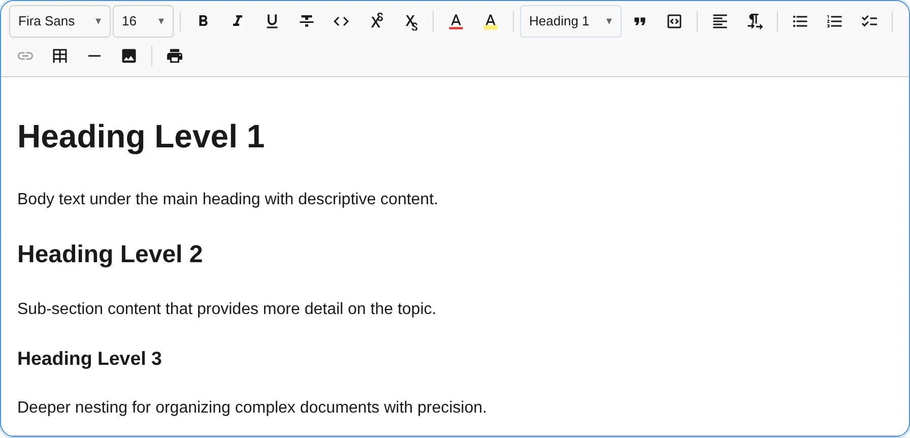
Section titled “Toolbar”The heading plugin renders as a dropdown selector in the toolbar. The dropdown label reflects the current block type (“Paragraph”, “Heading 1”, “Heading 2”, etc.). Each option is styled with the corresponding heading font size for visual preview.
Extending the Block Type Picker
Section titled “Extending the Block Type Picker”The dropdown is backed by a shared registry. Any plugin can add entries that automatically appear in the picker by calling registerBlockTypePickerEntry():
import type { Plugin, PluginContext } from '@notectl/core';
class FooterPlugin implements Plugin {  readonly id = 'footer';  readonly name = 'Footer';  readonly dependencies = ['heading']; // ensures picker exists
  init(context: PluginContext): void {    context.registerNodeSpec({      type: 'footer',      group: 'block',      content: { allow: ['text'] },      toDOM(node) {        const el = document.createElement('footer');        el.setAttribute('data-block-id', node.id);        return el;      },    });
    context.registerCommand('setFooter', () => {      // toggle logic...      return true;    });
    context.registerBlockTypePickerEntry({      id: 'footer',      label: 'Footer',      command: 'setFooter',      priority: 200,      style: { fontSize: '0.85em', fontWeight: '400' },      isActive: (state) => {        const block = state.getBlock(state.selection.anchor.blockId);        return block?.type === 'footer';      },    });  }}
Entries are sorted by priority (lower = first). The built-in entries use priorities 10–106. Use a higher value (e.g. 200+) to append custom entries.
See the Writing a Plugin guide for more details.
Keyboard Behavior
Section titled “Keyboard Behavior”| Key | Action |
|---|---|
Enter (empty heading) | Convert heading to paragraph |
Enter (at end of heading) | Split and convert new block to paragraph |
Node Specs
Section titled “Node Specs”| Type | HTML Tag | Attributes | Description |
|---|---|---|---|
heading | <h1> - <h6> | level: number (1-6) | Standard heading |
title | <h1> (with class notectl-title) | — | Document title |
subtitle | <h2> (with class notectl-subtitle) | — | Document subtitle |
The level attribute maps directly to the HTML heading tag. Title and Subtitle are styled variants that appear in the block type picker dropdown alongside heading levels.
All heading, title, and subtitle node specs set excludeMarks: ['fontSize']. When converting a block to one of these types, any existing fontSize marks are automatically stripped to maintain consistent heading sizes.