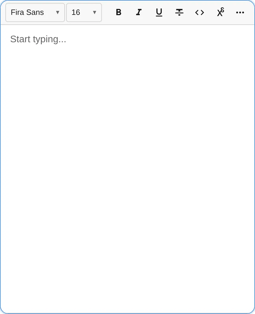
Toolbar Configuration
The notectl toolbar is fully declarative. You configure it by passing a toolbar option to createEditor() — an array of plugin groups that maps directly to the visual layout.

Basic Setup
Section titled “Basic Setup”The toolbar option is an array of arrays. Each inner array represents a visual group of toolbar buttons, with separators rendered between groups:
import { createEditor } from '@notectl/core';import { TextFormattingPlugin } from '@notectl/core/plugins/text-formatting';import { HeadingPlugin } from '@notectl/core/plugins/heading';import { ListPlugin } from '@notectl/core/plugins/list';
const editor = await createEditor({  toolbar: [    [new TextFormattingPlugin()],   // Group 1: B, I, U    [new HeadingPlugin()],          // Group 2: Heading dropdown    [new ListPlugin()],             // Group 3: List buttons  ],});
The order of groups and plugins within groups determines their visual order in the toolbar.
How It Works
Section titled “How It Works”When you provide a toolbar config:
- A
ToolbarPluginis automatically created with the group layout - Each plugin in the toolbar arrays is registered with the editor
- Plugins register their toolbar items during
init() - The ToolbarPlugin renders buttons in the order defined by your groups
Without Toolbar
Section titled “Without Toolbar”If you don’t need a toolbar (headless mode), use the plugins array directly:
const editor = await createEditor({ plugins: [ new TextFormattingPlugin(), new HeadingPlugin(), new ListPlugin(), ],});In this mode, no toolbar UI is rendered. You control formatting through the command API:
editor.executeCommand('toggleBold');editor.executeCommand('setHeading1');Mixing Toolbar and Extra Plugins
Section titled “Mixing Toolbar and Extra Plugins”You can use toolbar for visible plugins and plugins for background plugins that don’t need toolbar UI:
const editor = await createEditor({ toolbar: [ [new TextFormattingPlugin()], [new HeadingPlugin()], ], plugins: [ myCustomMiddlewarePlugin, myAnalyticsPlugin, ],});Full Toolbar Example
Section titled “Full Toolbar Example”Here’s a complete toolbar setup with all built-in plugins organized into logical groups:
import { createEditor } from '@notectl/core';import { TextFormattingPlugin } from '@notectl/core/plugins/text-formatting';import { HeadingPlugin } from '@notectl/core/plugins/heading';import { BlockquotePlugin } from '@notectl/core/plugins/blockquote';import { LinkPlugin } from '@notectl/core/plugins/link';import { ListPlugin } from '@notectl/core/plugins/list';import { TablePlugin } from '@notectl/core/plugins/table';import { CodeBlockPlugin } from '@notectl/core/plugins/code-block';import { HorizontalRulePlugin } from '@notectl/core/plugins/horizontal-rule';import { StrikethroughPlugin } from '@notectl/core/plugins/strikethrough';import { SuperSubPlugin } from '@notectl/core/plugins/super-sub';import { HighlightPlugin } from '@notectl/core/plugins/highlight';import { TextColorPlugin } from '@notectl/core/plugins/text-color';import { AlignmentPlugin } from '@notectl/core/plugins/alignment';import { FontPlugin } from '@notectl/core/plugins/font';import { FontSizePlugin } from '@notectl/core/plugins/font-size';import { ImagePlugin } from '@notectl/core/plugins/image';import { HardBreakPlugin } from '@notectl/core/plugins/hard-break';import { STARTER_FONTS } from '@notectl/core/fonts';
const editor = await createEditor({  toolbar: [    // Text formatting: Bold, Italic, Underline    [new TextFormattingPlugin({ bold: true, italic: true, underline: true })],    // Block types: Paragraph / Heading selector    [new HeadingPlugin()],    // Block elements    [new BlockquotePlugin(), new LinkPlugin()],    // Lists: Ordered and Unordered    [new ListPlugin()],    // Tables and Images    [new TablePlugin(), new ImagePlugin()],    // Code blocks    [new CodeBlockPlugin()],    // Additional inline formatting    [      new HorizontalRulePlugin(),      new StrikethroughPlugin(),      new SuperSubPlugin(),      new HighlightPlugin(),      new TextColorPlugin(),    ],    // Typography: Alignment, Font, Size    [      new AlignmentPlugin(),      new FontPlugin({ fonts: [...STARTER_FONTS] }),      new FontSizePlugin({ sizes: [12, 16, 24, 32, 48], defaultSize: 16 }),    ],  ],  plugins: [new HardBreakPlugin()], // No toolbar UI needed  placeholder: 'Start typing...',  autofocus: true,});
Responsive Overflow Behavior
Section titled “Responsive Overflow Behavior”When the viewport is too narrow to display all toolbar items, notectl can handle the overflow automatically. Three modes are available via ToolbarOverflowBehavior:
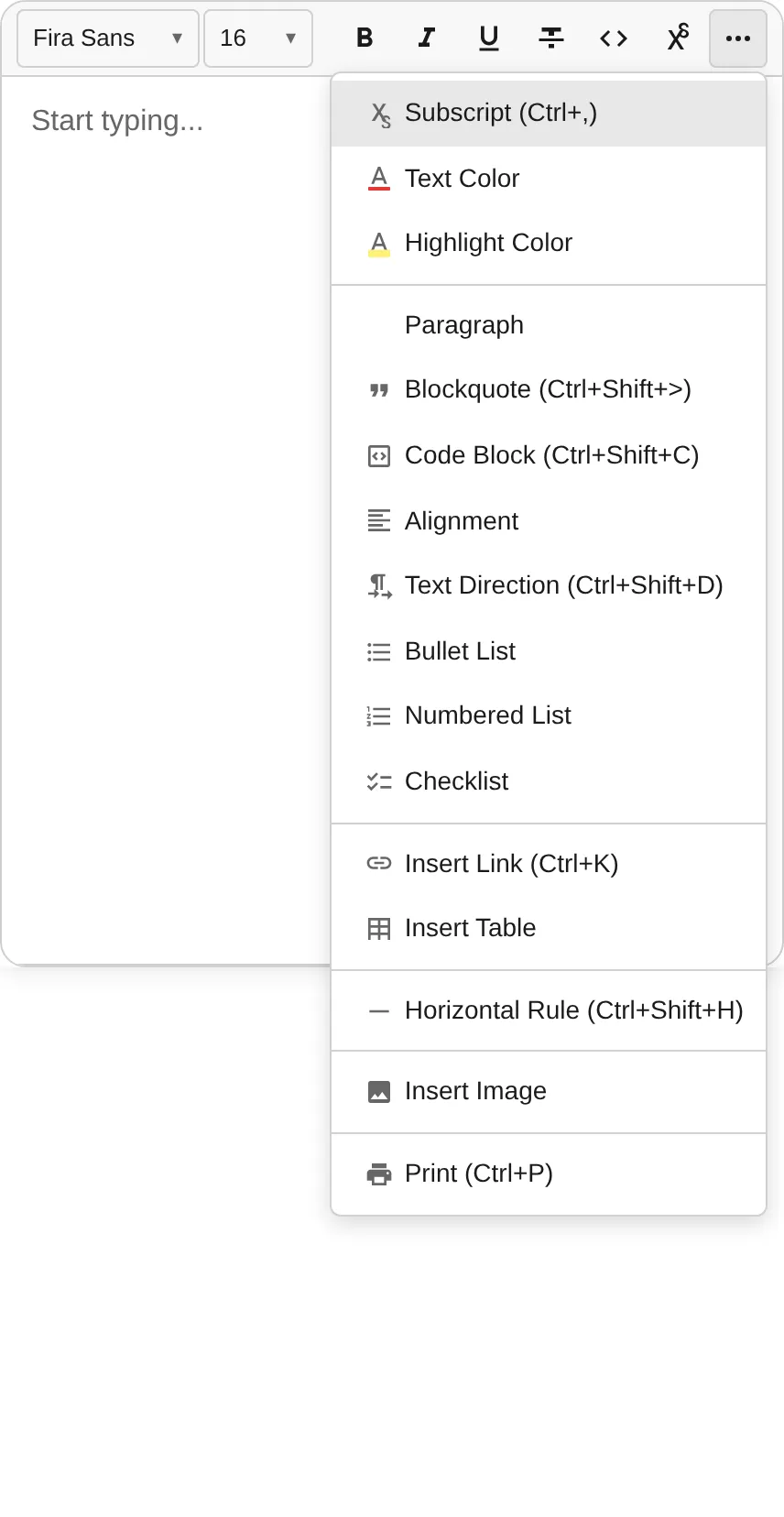
BurgerMenu (Default)
Section titled “BurgerMenu (Default)”Items that don’t fit are hidden behind a ”…” dropdown button. The overflow controller measures available width using a ResizeObserver and redistributes items dynamically.
Click the ”…” button to reveal the hidden items in a dropdown menu:
import { createEditor } from '@notectl/core';import { ToolbarOverflowBehavior } from '@notectl/core/plugins/toolbar';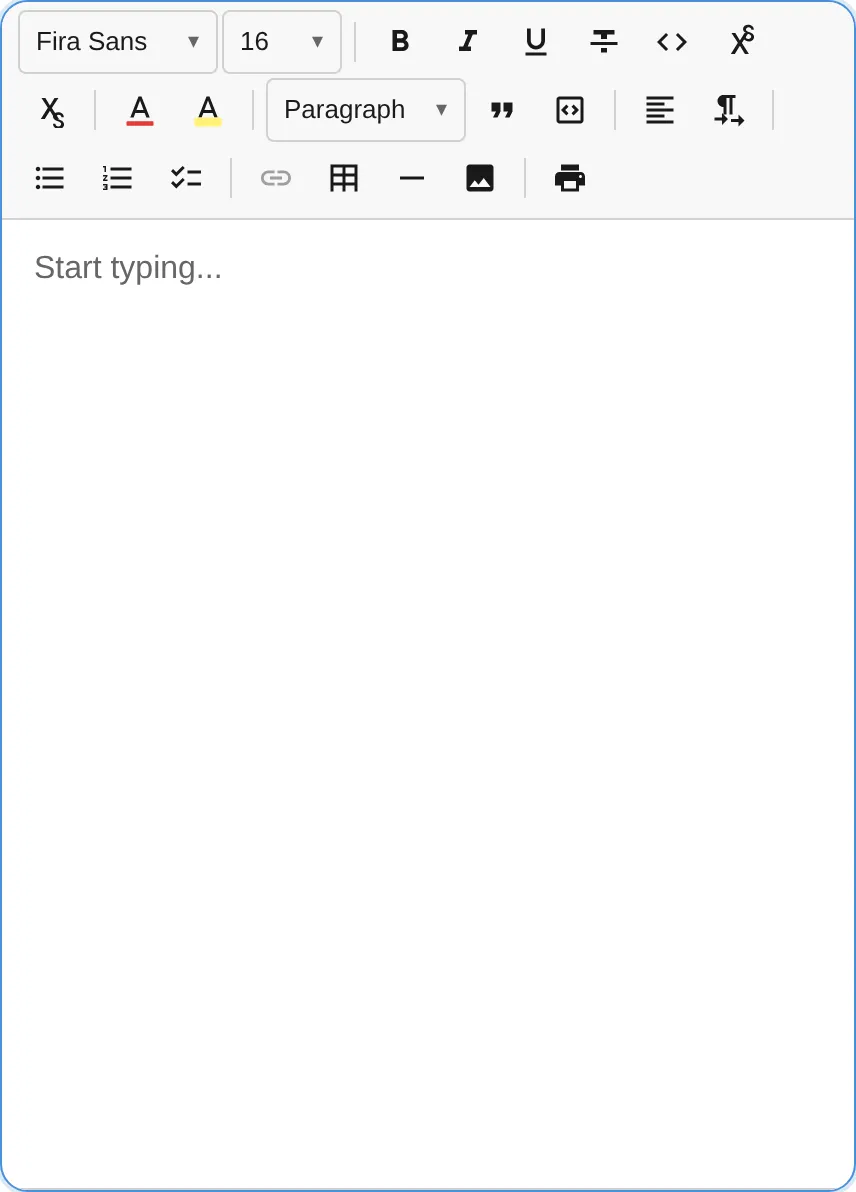
const editor = await createEditor({ toolbar: { groups: [ [new TextFormattingPlugin()], [new HeadingPlugin()], [new ListPlugin()], ], overflow: ToolbarOverflowBehavior.BurgerMenu, // default },});The toolbar wraps to multiple rows when items overflow. This is a pure CSS solution — no JavaScript measurement is needed.
const editor = await createEditor({ toolbar: { groups: [ [new TextFormattingPlugin()], [new HeadingPlugin()], [new ListPlugin()], ], overflow: ToolbarOverflowBehavior.Flow, },});No responsive behavior. Items that exceed the container width are clipped. Use this when you control the layout externally or know the toolbar will always fit.
const editor = await createEditor({ toolbar: { groups: [[new TextFormattingPlugin()]], overflow: ToolbarOverflowBehavior.None, },});Toolbar Item Ordering
Section titled “Toolbar Item Ordering”Within each toolbar group, items are rendered in registration order — the order in which plugins call context.registerToolbarItem() during init(). Since plugins are initialized in the order you list them in the toolbar config, you control the button order directly:
const editor = await createEditor({ toolbar: [ // Bold appears before Italic because TextFormattingPlugin registers them in that order [new TextFormattingPlugin({ bold: true, italic: true })], // HeadingPlugin buttons appear in this group, after the separator [new HeadingPlugin()], ],});To reorder buttons, rearrange the plugins within the group arrays.